☆ Research You Can Trust ☆ IFTA Certified Technical Analyst ✔
Published research shows the most reliable and profitable stock chart patterns are the inverse head and shoulders, double bottom, triple bottom, and descending triangle. Each has a proven success rate of over 85%, with an average gain of 43%.
As a certified technical analyst, I can offer you a unique way of truly understanding stock chart patterns.
I have written a book and produced countless hours of videos and podcasts dedicated to the technical analysis of the stock markets.
A stock chart pattern is a method for interpreting the supply and demand actions of buyers and sellers in the market to determine whether the trend will continue or reverse.
Each trend is either up, down, or sideways. You can determine the shape of a chart pattern by drawing support or resistance lines on the chart’s price pattern.
The above paragraph is crucial to understanding all stock chart patterns, including trends that continue or reverse, as well as up and down trends, and support and resistance lines.
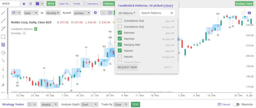
Stock Chart Pattern Recognition
Understanding and recognizing these chart patterns can be challenging and time-consuming. Even when you think you have memorized all 46 chart patterns featured in this guide, recognizing them quickly and effectively when trading is a real issue.
TrendSpider saves you time performing technical analysis by automating trendline and pattern recognition and analyzing multiple indicators and timeframes on the same stock chart. It’s the best for automated smart chart analysis for stocks, crypto, and forex.
Now that we have established the three trend types, we can understand that the two major chart pattern types below are trying to interpret if the uptrend, downtrend, or consolidation will continue in the same direction or reverse.
Continuation Pattern: These patterns indicate that the stock price will continue in the same direction, either up or down.
Reversal Pattern The reversal pattern indicates that the stock price stops moving on its current trajectory and begins moving in the opposite direction.
Continuation Patterns
Continuation patterns occur during a stock price move and are visual representations of consolidation or periods of rest before the price continues its current trend, upwards or downwards. If you see a continuation pattern, you should expect the stock price to continue in the direction it had before the pattern formed.
All of these triangles are essentially continuation patterns. They should give you some confidence that the trend will continue. Always be aware that you should be prepared to act if the price breaks out in the wrong direction due to a shock (e.g., bad earnings or bad news).
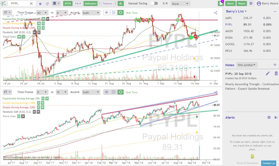
Automated Trendline Recognition
Only one software vendor currently uses artificial intelligence to automate the identification and plotting of trendlines and patterns. TrendSpider can detect trendlines from minutes to weeks on multiple timeframes and plot them all on a single stock chart.
Automated Trendline Pattern Recognition with TrendSpider
Support Line: The support line connects all the stock price lows. You can expect the stock price to decrease when there is a breakdown through the support line.
Resistance Line: The resistance line connects all the stock price highs. You can expect the stock price to increase when there is a breakup through the support line.
It may sound complicated now, but in a later section, this is all explained.
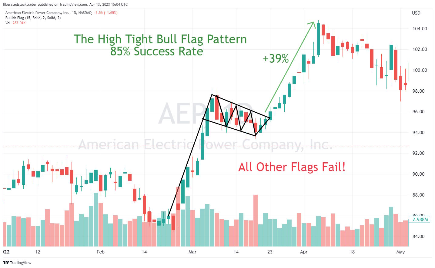
A bull flag pattern is a chart pattern that looks like a flag and appears when the stock price moves up quickly, then consolidates in a narrow range before continuing the uptrend. In contrast, a bear flag pattern is the opposite of a bull flag pattern and appears after a sharp decline in the stock price. The decline is followed by a period of consolidation in a narrow range before continuing the downward trend.
Only one bull flag pattern has a success rate of 85%, while the rest have a failure rate of 55%. The high-tight bull flag is the only flag pattern you should trade.
The bull flag stock chart pattern starts with a price uptrend and is then met by buyers’ resistance to this new price high.
As the stock price moves down, the buyers buy at new lows, displaying confidence that the stock price will increase. When the price breaks through the upper parts of the flag pattern, that is the time to buy.
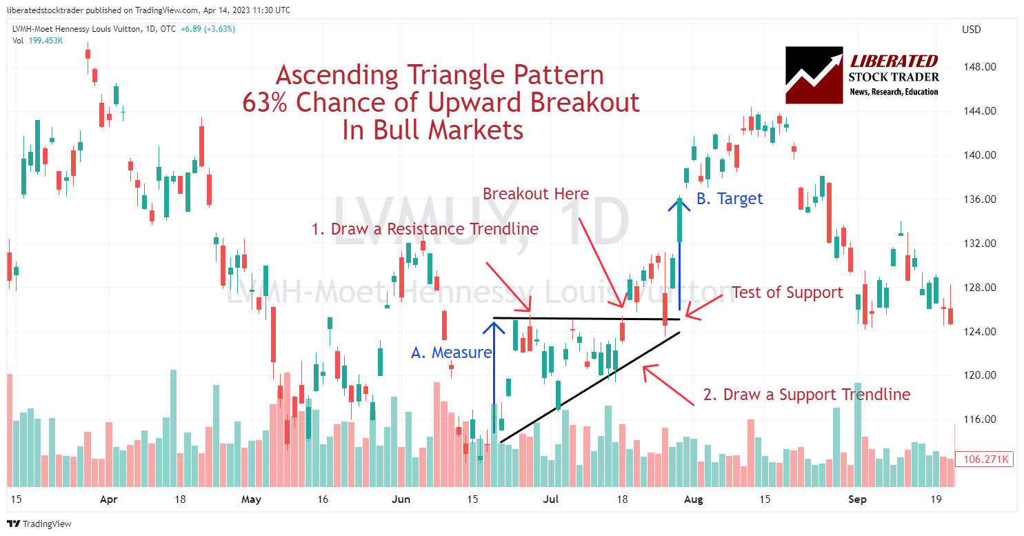
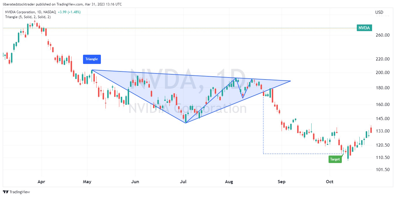
The ascending triangle is a powerful technical analysis pattern with a predictive accuracy of 83%. It is flexible, can break out up or down, and can be a continuation or reversal pattern.
An ascending triangle consists of an upward-sloping trendline connecting a series of higher lows and a horizontal trendline connecting a series of highs. Depending on the direction of the price breakout, this pattern can indicate either a bearish or bullish trend, serving as a potential reversal or continuation signal.
How to Identify & Trade an Ascending Triangle
When trading this chart pattern, traders will look for the breakout above the resistance level. This is typically met with increased buying pressure and is the time to buy. Traders should place their stop loss below the most recent low of the triangle pattern to protect against a false breakout.
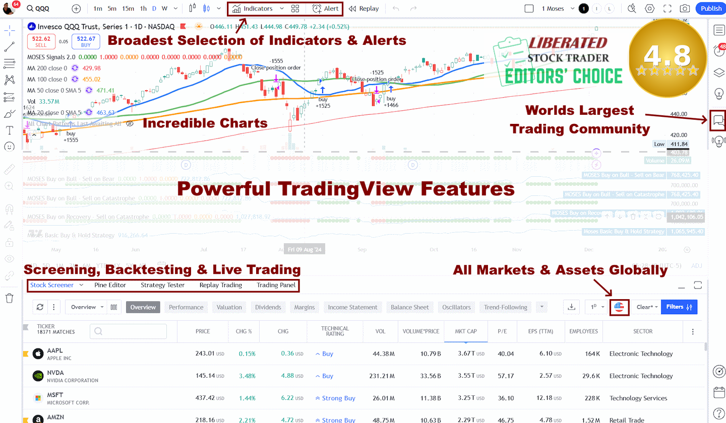
TradingView
4.8/5⭐
: The Best Trading Platform I’ve Tested in 20+ Years
With lightning-fast charts, powerful pattern recognition, smart screening, backtesting, and a global community of 20+ million traders — it’s a powerful edge in today’s markets.
If you want one platform that gives you an edge, this is it.
A descending triangle is a powerful technical analysis pattern with a predictive accuracy of 87%. The pattern is flexible, can break out up or down, and is a continuation or reversal pattern. Source
A descending triangle has one declining trendline that connects a series of lower highs and a second horizontal trendline that connects a series of lows. A descending triangle can be bearish or bullish or a reversal or continuation pattern, depending on the direction of the price breakout.
Descending Triangle Chart Pattern
The descending triangle chart pattern occurs when sellers are in control, but buyers are not willing to let the trend continue lower without putting up some resistance. As buyers become more active and force prices to stay near the same level, the support line begins to flatten out. Eventually, a breakout occurs in either direction, signaling a reversal or continuation of the trend.
The descending triangle chart pattern is considered a reliable continuation or reversal point in the market, with an 87% success rate on an upward breakout in bull markets. This is because buyers begin to take control of the market when the price breaks above the triangle.
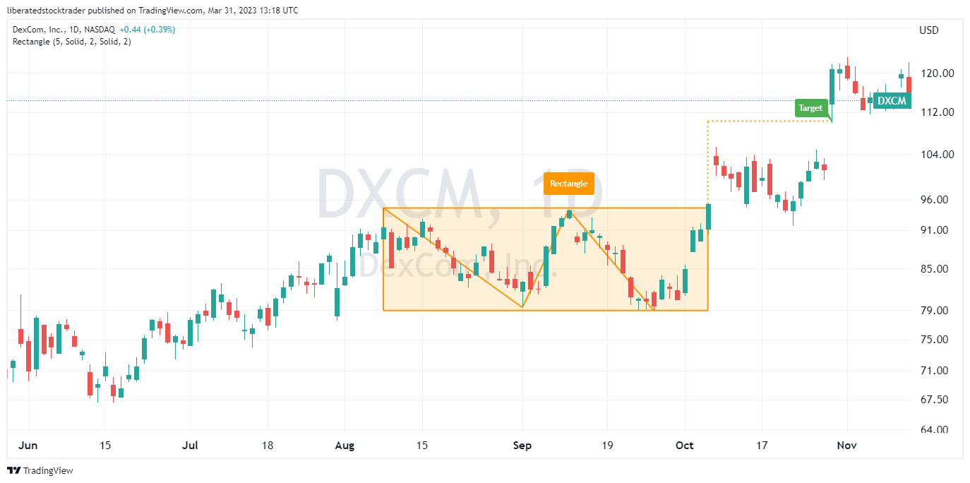
A popular continuation pattern is the rectangle formation, more commonly known as a” “channel” or “trading range.” The price should normally break out in the same direction as the previous trend.
The rectangle pattern has an 85% success rate in bull markets and an average profit potential of +50%. The rectangle pattern is popular because it is reliable, occurs frequently, and generates a good win probability.
The rectangle chart pattern can be identified by looking for two horizontal parallel lines that act as support and resistance levels. The support and resistance levels are usually drawn horizontally, connecting the price highs and price lows.
These two lines should be relatively equal in length, with at least two touches on each side of the parallel lines before a breakout.
Look for horizontal support and resistance lines to identify a rectangle chart pattern. The pattern should generally be visible on an intraday and daily chart, but rectangles occur more frequently on 15-minute and hourly charts.
The rectangle means a period in which the buyers and sellers, or supply and demand, are at equilibrium; this means sideways consolidation.
It is often considered a resting or cooling down period, and most technical analysts expect a breakthrough of the resistance or support line to mean a continuation of the uptrend.
But beware, if the break of the consolidation pattern is in the opposite direction, this means a reversal pattern.
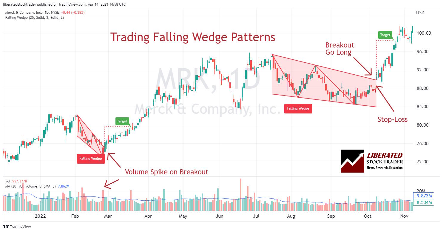
Falling wedges have a very different character from triangles because they point in the same direction to the breakout. When the wedge pattern points down, the stock price should move upwards theoretically.
A falling wedge is a technical analysis pattern with a predictive accuracy of 74%. The pattern can break out up or down but is primarily considered bullish, rising 68% of the time. The falling wedge is formed when an asset price rises, but instead of continuing its upward trajectory, it contracts as the trading range tightens.
In the image below, we can see that the falling wedges signify an upward breakout.
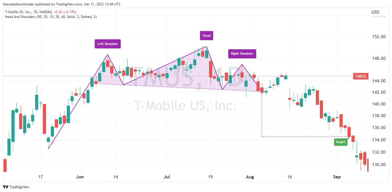
The most predictive of all stock chart patterns is the Head and Shoulders. The head and shoulders pattern is a technical analysis tool to identify potential reversals in the stock market. Since it involves two highs, followed by a low, then another high, it can be used to predict an impending reversal of an uptrend.
Head & Shoulders Top Chart Pattern
Generally, the pattern should be visible on intraday, daily, and weekly charts. After identifying the three peaks, investors can look for a confirmation of a trend reversal by watching for a breakout either above the upper resistance line or below the lower support line.
If the security price breaks out below the support line, it could signal that the security has completed its reversal. In contrast, a break above the resistance line could signal a resumption of the uptrend.
It should be noted that further confirmation of this stock chart pattern should not be relied upon until after prices have moved beyond these levels.
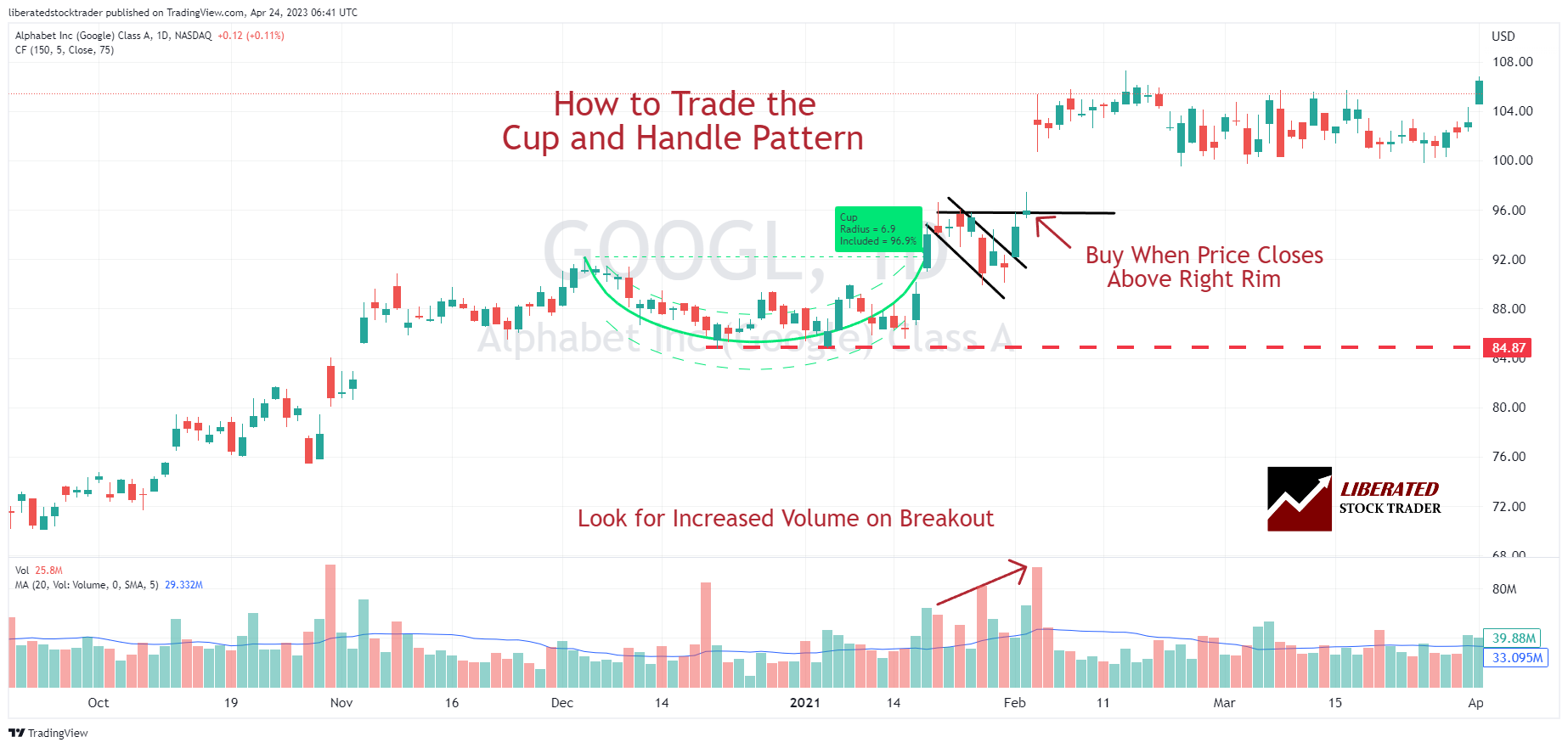
The cup and handle pattern has a 95% success rate and depicts a situation where buyers and sellers reach a long, slow decision point. The cup and handle chart pattern can be difficult to recognize.
To spot it, observe a “cup” shape in the asset’s chart formed when there is an upward price rise and then a slow decline over at least 30 trading days. The next thing to spot is two decreasing trendlines, which make the “handle.” The handle must be less steep than the cup and last at least five days.
The stock price stops moving and gradually makes higher lows and higher highs. Just as it looks like the price will break upwards, the price moves back down, but it is only getting prepared for a stellar breakout. This pattern is crucial for traders to identify before making trading decisions. Learn more about the cup and handle chart pattern here. If you are a short-seller, learn about the success rates of the inverse cup and handle patterns (Hint: It’s very good)
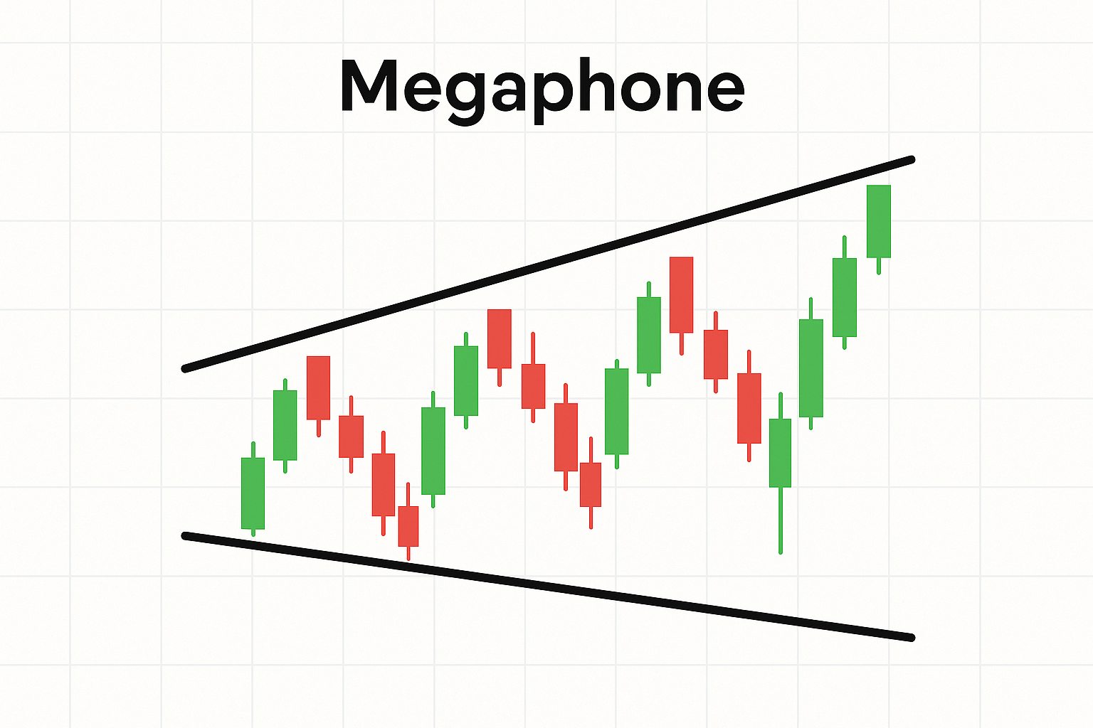
The Megaphone top pattern is a visual representation of an asset’s price, indicating an uptrend followed by a volatile period. It is marked by a series of higher highs and higher lows, much like the Cup and Handle Pattern. However, instead of creating a cup shape as the stock rises, the price forms two symmetrical lines on either side.
A Megaphone Price Pattern in Technical Analysis
The lines form what looks like a megaphone, hence its name. As prices move up and down along these lines, the volatility increases until it reaches its peak at the end of the pattern. This typically signals that a reversal may soon be underway as buyers become exhausted from the frenzy created by this volatile chart pattern.
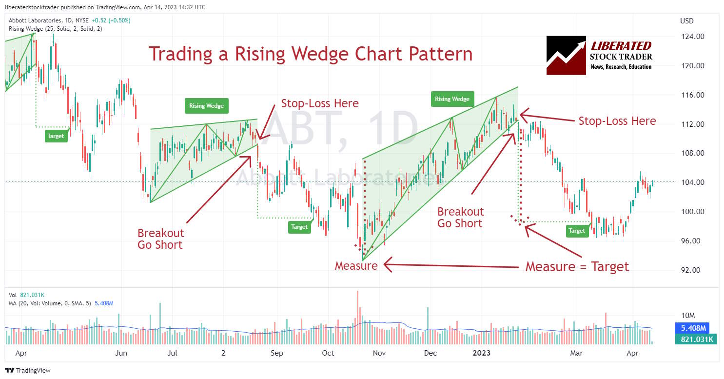
9. Rising Wedge
The rising wedge pattern is a technical indicator that signals an impending downward trend. It begins with a similar shape to an uptrend, with prices forming higher highs and higher lows. However, as the pattern progresses, the highs and lows begin to flatten out, forming two converging lines. This forms a wedge shape on the chart and indicates buyers are losing steam and momentum waning. Eventually, the price breaks through the support line and declines downward. This can be seen as an indication of bearish sentiment in the market.
Trading a Rising Wedge/Ascending Wedge Pattern
Rising wedges have a very different character from triangles because they point in the exact opposite direction to the breakout. Both edges of the wedge point in the same direction, either upwards or downwards. In the image below, we can see that the Rising Wedges signify a downward price breakout.
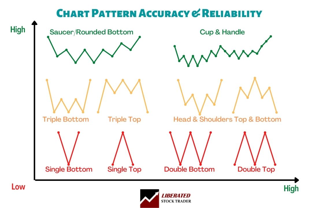
Price patterns and trend lines share the same characteristics. The longer they are, the more important they are. The more a price pattern touches a trend line and reverses, the more important that line is. Below, we see that a triple top or triple bottom accuracy is more than that of a single Top. Why? Because the price touches the Resistance level more times.
The following diagram shows us the most common reversal patterns and their relative probability of accuracy.
Reversal Patterns Accuracy Matrix
Chart Pattern Accuracy & Reliability
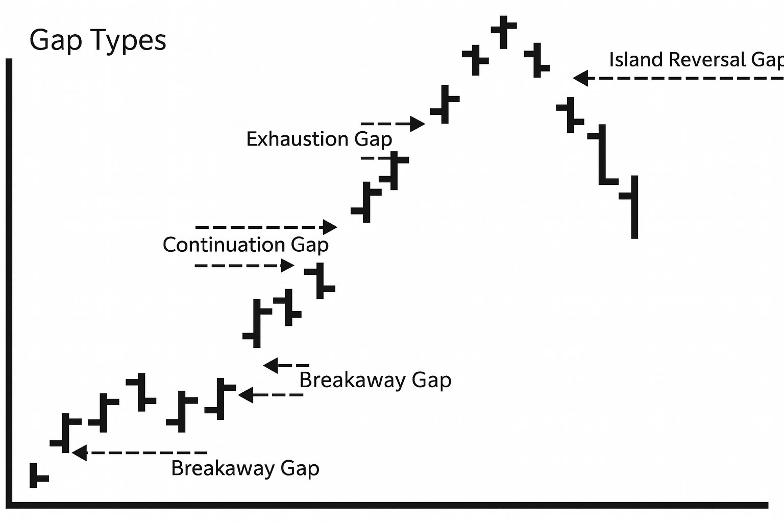
11. Gap Patterns
Another essential pattern that signals continuation is the gap. A gap occurs when the price of a stock during a given period is significantly higher or lower than the price range of that stock for the previous period. The prices did not overlap at all over the two periods.
The 4 Main Types of Gap Patterns in Stock Charts. Breakaway Gap, Continuation Gap, Exhaustion Gap & Island Reversal Gap
This leaves what is known as a gap in the price chart. A gap in the stock price is a show of strength. It tells us that the demand for the stock was so strong on the open that it jumped many points higher. The opposite is true for a gap down. This signifies weakness as the stock gaps down, usually due to aggressive selling.
12. The Breakaway Gap
The breakaway gap usually occurs when a stock moves through a price range or channel, then the demand for the stock explodes, and the stock “gaps out” of the current trend. This is a sign of strength and a very bullish sign with a “gap up.” A breakaway gap to the downside is a sure sign of weakness.
13. The Continuation Gap
The Continuation Gap is another sign of strength, showing that demand is still strong and the trend will continue; this often confirms the initial “breakaway gap.” The opposite is true and a sign of weakness if the gap continues down.
14. Exhaustion Gaps
Exhaustion gaps are usually the final type of gap in a trend, be it up or down. They occur at the end of a move and indicate reduced demand for the stock, as buyers and sellers have reached an agreement and the trend is ending. If the gap is up, it’s a sign of strength, while a gap down indicates weakness.
The exhaustion gap can be the second or third gap and occurs during a powerful price upsurge. This is a warning, as it might signify that the stock has overextended itself, possibly due to a change in trend or a pullback. The opposite is true for an exhaustion gap on the downside, which might signal a bottom is near.
15. The Island Gap
The island gap occurs when demand is so high that price and the market participants drive the price up to unacceptable levels, and the demand dries up rapidly. This sudden oversupply causes the stock to plummet as all demand is satiated. Of course, too much supply with no demand causes falling prices.
Quick Tip: Gaps are important signs of serious shifts in supply and demand. If surges in demand outstrip the supply, prices rise to convince people on the sidelines to sell. Downside gaps indicate supply is outstripping demand, causing prices to fall.
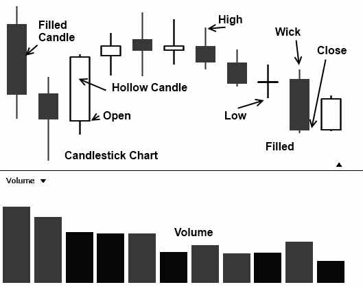
Used widely in Japan and gaining a strong foothold in the rest of the world, the Japanese Candlestick chart gives an excellent insight into current and future price movements. They named them candlesticks because they look like candlesticks with a wick and the main body.
Japanese Candlestick Chart
Candlesticks give an excellent view of the Open, High, Low, and close of the price—pictorially illuminating and easy-to-see trends. Below is a full reference to 1-bar to 4-bar patterns, which helps us judge price direction. They connect psychology with price patterns.
Although Candlesticks have many advantages, they can seem like information overload to the beginner. There are also many Candlestick patterns to learn.
As we are concerned with spotting changes in price moves, we will focus on the Reversal Patterns. This section is the Bullish Reversal Pattern, meaning when a price is moving down, and you see this sign, the price may change direction and start moving up in the short term. These are the most common patterns. They will give you an idea of what is common in all patterns.
17. The Hammer
The Hammer can be either filled or hollow; the Japanese say the price is hammering out a bottom. What is important here is that at the end of a down move, the buyers and sellers test out an extreme low (the long shadow); however, by the closing bell, the price has returned higher.
The lows were tested, but the price increased; there were enough buyers at this level to increase the price.
18. Inverted Hammer Chart Pattern
The Inverted Hammer shows that the stock gaps are significantly down at the end of a downward move. There is much movement throughout the day, moving back to fill the gap, but the price settles lower for the day. This shows significant price action, and buyers show a strong interest in the stock at these levels.
19. Bullish Engulfing Chart Pattern
Here, we have a negative spinning top or a short day during a downtrend, followed by a long day of real power; the long white body tells you something significant has changed, and so has the sentiment, a clear trend reversal.
20. Bullish Harami Chart Pattern
We experience a very negative “Long Day” followed by a short positive day during a downtrend. This indicates the market participants have found a level they are happy with. Candlesticks are most useful when predicting a change in trend; this might be from an “up” to a “down” trend or from a “down” trend to a “sideways” trend. In the case of this Harami, the change in trend may be from downwards to sideways.
21. Piercing Line Chart Pattern
This shows a day of real strength following a very negative day. The White candle gaps down on open, but the buyers show real demand throughout the day to retrace more than 50% of the previous day’s losses.
22. Avoid the Pennant Pattern
The Pennant stock chart pattern shows that the stock price meets resistance during an uptrend, and the uptrend temporarily halts. Here, you see lower highs but also a horizontal support line.
This indicates that the sellers are unwilling to sell for less than this price, which builds momentum for a break out through the support line onto new highs for the stock price.
Summary
This huge article covered everything you need to know about stock chart patterns and supply and demand. The problem is that it is difficult to read about it on a screen and understand how to apply these principles in real-world technical analysis of stock trends. This is why I have created the Liberated Stock Trader Pro Training to help guide you through this maze and help you truly understand with 16 hours of detailed video training and a print book.
The Encyclopedia of Chart Patterns by Tom Bulkowski details the reliability and success rates of 65 chart patterns and shows you how to trade them. It is an indispensable resource for traders and investors seeking to enhance their profitability by leveraging stock chart patterns. This comprehensive reference book provides in-depth explanations and detailed illustrations of over 65 different patterns, including Head and Shoulders, Double Tops, Wedges, Flags, Gaps, and more.
With a wealth of experience spanning 25 years in stock investing and trading, Barry D. Moore (CFTe) is an author and Certified Financial Technician (Market Analyst) recognized by the International Federation of Technical Analysts (IFTA). Notably, he has also held executive positions in leading Silicon Valley corporations IBM Corp. and Hewlett Packard Inc.
2 COMMENTS
Hi,
I just read your webpage and I would like to thank you for making a free guide to visual stock analysis. As a beginner with very little money, it is appreciated.
I was wondering if you thought to apply the concepts used in your program toward analysis of human behavior and psychology to determine things such as customer count in a business per hour, day, and year given current trends and data (weather, location, type of business, social media, etc)?
For staffing purposes, efficiency, and flow state.
We need more correct programs like this because turnover rates are high (at least in the U.S) and quality of service is suffering because employees don’t have work environments where they can get into the flow state, managers are suffering because of this, and revenue generated declines due to those things. The ones that we have don’t do it very well, and I feel like you could apply the data that you use in your software towards that and have a marketable product that improves the lives of many people.
Just a thought, from a burnt-out former Barista who sees the patterns in life but doesn’t have the tools to describe them effectively in a way that makes companies listen :’)
Thank you for reading and have a wonderful day.
Hi Liz, now that is a thoughtful insight. I think the only limits are data. Tech companies already do this to a huge extent and can predict customer behavior based on those exact factors. Uber, Booking, Airbnb, Walmart, Amazon all predict customer behavior because they have the data.
thanks
Barry
This website uses cookies to improve your experience while you navigate through the website. Out of these cookies, the cookies that are categorized as necessary are stored on your browser as they are essential for the working of basic functionalities of the website. We also use third-party cookies that help us analyze and understand how visitors use this website. These cookies will be stored in your browser only with your consent. You also have the option to opt-out of these cookies by leaving the website.
We do not use cross-site tracking cookies or advertising networks, just the basic analytics and session data.
Necessary cookies are absolutely essential for the website to function properly. This category only includes cookies that ensures basic functionalities and security features of the website. These cookies do not store any personal information.
Cookie
Type
Duration
Description
__stripe_mid
Persistent
1 month
This cookie is set by the Stripe payment gateway. This cookie is used to enable payment on the website without storing any payment information on a server.
__stripe_sid
Session
30 minutes
This cookie is set by the Stripe payment gateway. This cookie is used to enable payment on the website without storing any payment information on a server.
_ga
Analytics
2 years
This cookie is installed by Google Analytics. The cookie is used to calculate visitor, session, campaign data and keep track of site usage for the site's analytics report. The cookies store information anonymously and assign a randomly generated number to identify unique visitors.
_gat
Performance
1 minute
This cookie is installed by Google Universal Analytics to throttle the request rate to limit the collection of data on high traffic sites.
_gid
Analytics
1 day
This cookie is installed by Google Analytics. The cookie is used to store information of how visitors use a website and helps in creating an analytics report of how the wbsite is doing. The data collected including the number visitors, the source where they have come from, and the pages viisted in an anonymous form.
cookielawinfo-checkbox-non-necessary
Persistent
1 month
This cookie is set by GDPR Cookie Consent plugin. The cookie is used to store the user consent for the cookies.


Hi,
I just read your webpage and I would like to thank you for making a free guide to visual stock analysis. As a beginner with very little money, it is appreciated.
I was wondering if you thought to apply the concepts used in your program toward analysis of human behavior and psychology to determine things such as customer count in a business per hour, day, and year given current trends and data (weather, location, type of business, social media, etc)?
For staffing purposes, efficiency, and flow state.
We need more correct programs like this because turnover rates are high (at least in the U.S) and quality of service is suffering because employees don’t have work environments where they can get into the flow state, managers are suffering because of this, and revenue generated declines due to those things. The ones that we have don’t do it very well, and I feel like you could apply the data that you use in your software towards that and have a marketable product that improves the lives of many people.
Just a thought, from a burnt-out former Barista who sees the patterns in life but doesn’t have the tools to describe them effectively in a way that makes companies listen :’)
Thank you for reading and have a wonderful day.
Hi Liz, now that is a thoughtful insight. I think the only limits are data. Tech companies already do this to a huge extent and can predict customer behavior based on those exact factors. Uber, Booking, Airbnb, Walmart, Amazon all predict customer behavior because they have the data.
thanks
Barry